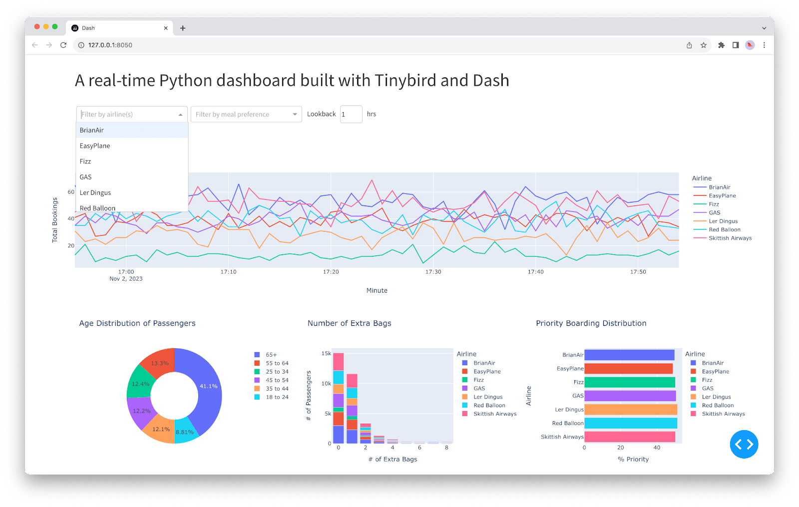
In this guide, we’ll walk through creating a real-time data dashboard using Python. We’ll use the Dash framework by Plotly, which allows for easy web-based dashboards, and integrate it with live data to create dynamic, updating visuals.
Step 1: Set Up Your Development Environment
- Install Python: Ensure Python is installed on your system. You can download it from python.org.
- Create a Virtual Environment (Optional but Recommended):
   python3 -m venv mydashboardenv
source mydashboardenv/bin/activate # On Windows use `mydashboardenv\Scripts\activate`- Install Required Libraries:
pip install dash pandas plotlyStep 2: Set Up Your Data Source
For this example, let’s simulate real-time data using random values. In a real-world scenario, you could pull data from an API, database, or other sources.
import pandas as pd
import numpy as np

def generate_random_data():
    """Simulates real-time data generation"""
    data = {
        'time': pd.Timestamp.now(),
        'value': np.random.randn()
    }
    return pd.DataFrame([data])

# Example usage
if __name__ == "__main__":
    print(generate_random_data())
Step 3: Create the Dashboard Layout
Now that we have our data source, let’s set up the Dash application and define the layout of our dashboard.
import dash
from dash import dcc, html
import plotly.graph_objs as go

app = dash.Dash(__name__)

app.layout = html.Div(children=[
    html.H1("Real-Time Data Dashboard"),
    dcc.Graph(id='live-graph', animate=True),
    dcc.Interval(
        id='graph-update',
        interval=1000,  # in milliseconds
        n_intervals=0
    )
])

if __name__ == "__main__":
    app.run_server(debug=True)
Step 4: Add Real-Time Data Updates
To make the graph update with new data in real-time, we’ll use Dash’s dcc.Interval component. This will trigger a callback function at regular intervals, which will update the graph with new data.
import dash
from dash import dcc, html
from dash.dependencies import Input, Output
import plotly.graph_objs as go
import pandas as pd
import numpy as np

app = dash.Dash(__name__)

# Function to generate random data
def generate_random_data():
    """Simulates real-time data generation"""
    data = {
        'time': pd.Timestamp.now(),
        'value': np.random.randn()
    }
    return pd.DataFrame([data])

# Layout of the dashboard
app.layout = html.Div(children=[
    html.H1("Real-Time Data Dashboard"),
    dcc.Graph(id='live-graph', animate=True),
    dcc.Interval(
        id='graph-update',
        interval=1000,  # in milliseconds
        n_intervals=0
    )
])

# Callback function to update the graph
@app.callback(Output('live-graph', 'figure'),
              [Input('graph-update', 'n_intervals')])
def update_graph_scatter(n):
    df = generate_random_data()

    data = go.Scatter(
        x=df['time'],
        y=df['value'],
        name='Scatter',
        mode='lines+markers'
    )

    return {'data': [data],
            'layout': go.Layout(
                xaxis=dict(range=[min(df['time']), max(df['time'])]),
                yaxis=dict(range=[-3, 3]),
                title="Live Data"
            )}

if __name__ == "__main__":
    app.run_server(debug=True)
Step 5: Enhance with Additional Features
You can now enhance your dashboard by:
- Adding Multiple Graphs: Track different data points on the same dashboard.
- Incorporating Historical Data: Combine real-time data with historical data for better insights.
- Customizing the Layout: Use CSS and more complex Dash components to create a polished interface.
Example of adding a secondary graph:
# Add another graph to the layout
app.layout = html.Div(children=[
    html.H1("Real-Time Data Dashboard"),
    dcc.Graph(id='live-graph', animate=True),
    dcc.Graph(id='live-graph-2', animate=True),  # New graph
    dcc.Interval(
        id='graph-update',
        interval=1000,  # in milliseconds
        n_intervals=0
    )
])

# Callback function to update the second graph
@app.callback(Output('live-graph-2', 'figure'),
              [Input('graph-update', 'n_intervals')])
def update_graph_scatter_2(n):
    df = generate_random_data()

    data = go.Bar(  # Using a bar chart for variety
        x=df['time'],
        y=df['value'],
        name='Bar'
    )

    return {'data': [data],
            'layout': go.Layout(
                xaxis=dict(range=[min(df['time']), max(df['time'])]),
                yaxis=dict(range=[-3, 3]),
                title="Live Data (Bar Chart)"
            )}
Step 6: Deploy Your Dashboard
- Deploy Locally: You can run the dashboard locally by running the Python script.
- Deploy to the Web: Use platforms like Heroku, AWS, or PythonAnywhere to deploy your dashboard online.
Example deployment on Heroku:
- Install
gunicorn:
pip install gunicorn- Create a
Procfile:
web: gunicorn app:server- Commit and push your code to a Git repository, then deploy to Heroku.
Conclusion
By following this guide, you’ve built a functional real-time data dashboard using Python, Dash, and Plotly. You can now expand it by integrating more complex data sources, adding more interactive components, or deploying it for use in production environments.


